Predictive models, one per coin, watch the crypto order book and candles and
emit a buy/sell confidence every second. This page follows the whole pipeline
— from the raw market firehose to live orders on Binance — and ends
on the bot’s live read, this second.
checking feed…
Live
Running right now
Everything above describes a system that is, as you read this, watching the
market. Below is its live output: for each coin, the model’s buy
confidence this second, against the threshold it must clear to act. When a bar
crosses its threshold, that is the bot deciding to enter.
Live · 5 coins from Hetzner
connecting to the feed…
Bar = buy confidence (0–1). The notch is the per-coin threshold;
a bar past the notch turns crimson — the bot would enter. Arrow shows
the last price tick’s direction.
The trajectory, coin by coin
The ticker is the snapshot; this is the path. Each dot is one prediction,
plotted as the price the model saw against the confidence it produced —
so you can watch a coin walk toward, or away from, its threshold over time.
Live · price × confidence
Connecting…
—
Each dot is one second’s prediction. The trajectory walks through price (x)
against the model’s buy confidence (y). The dashed line is the buy threshold —
points above it trigger the bot. Select multiple coins to compare confidence trajectories.
The firehose from Act 1 is still flowing. The candles are still forming, the
features still computing, the model still scoring. Everything on this page is
one continuous loop — and the numbers above are its read on the market,
this second.
§
A crypto market never stops talking. Every second, for every coin, it emits
a fresh burst of numbers — the last trades, the shape of the order
book, who is leaning to buy and who to sell. On its own that stream is
noise: too fast to read, too wide to hold in your head.
This is the story of the machine that turns that noise into a decision. It
runs continuously on a box in a German datacentre, collecting the firehose,
folding it into candles, computing close to two hundred features a second,
training and scoring models, and — when one is confident enough —
placing a real order on Binance. No background assumed: we build it up one
stage at a time, each shown with the production artifact rather than a
mock-up.
What this demonstrates
End-to-end ML system — data pipeline, training, model selection, live execution
Real-time engineering — a per-second firehose folded into ~190 features
MLOps discipline — every run tracked in MLflow, reproducible not vibes
Live in production — placing real orders on Binance right now
Every sample on this page is real, captured from the production system:
the raw rows and k-lines come straight off the live collector (their
timestamps are genuine Unix seconds), the architecture diagram and MLflow
and Binance screenshots are the system’s own, and the final feed is
live. Where a feature illustration needed a longer history than the short
samples carry, it is drawn schematically and labelled
illustrative — never fabricated numbers.
§
Act 01
The firehose
Start where the system starts: with what one coin actually looks like before
anyone has interpreted it. The collector wakes up every second, asks Binance
for the latest trades and the current order book, and writes a single row.
Here are three of those rows for ETH.
symbol
ts_begin
ts_end
open
low
high
close
wavg
volume
trades
twb0.3%
tws0.3%
twb1%
tws1%
eth
1780050104
1780050164
2010.35
2010.25
2010.87
2010.74
2010.5865
28.7425
129
692.631
820.6453
930.3267
1032.9208
eth
1780050105
1780050165
2010.35
2010.25
2010.87
2010.55
2010.6003
31.5912
137
692.631
820.6453
930.3267
1032.9208
eth
1780050165
1780050166
2010.55
2010.55
2010.55
2010.55
2010.55
0
0
688.9162
839.4716
928.0666
1050.0721
189 columns per row, about one row per second, per coin, 24/7.
You are seeing the first 14 columns of 3 rows — the other 175 keep
scrolling off to the right. Scroll the panel to feel the width.
The first ten columns are the familiar stuff: the symbol, the time bucket
(ts_begin / ts_end as
Unix seconds), open/low/high/close prices, a volume-weighted average price,
the traded volume and the number of trades. Then it gets more interesting:
the twb/tws columns are
trade-weighted order-book depth — how much buy and sell
liquidity sits within 0.3%, 1%, 3% and 10% of the mid-price. And those fourteen
are just the beginning: another ~170 derived indicators are appended to every
single row.
Where this came from
These are unedited rows captured from the production collector running on a
Hetzner box. The timestamps are real Unix seconds; the third row is a
one-second bucket with a single trade, which is why its open, high, low and
close all collapse to the same price and its volume is zero.
No human reads this. No model trains on it directly either — it is too
fast and too raw. The first thing the system does is fold time into something
a person, and a model, can actually hold: candles.
A market emits noise a thousand times a second. The rest of this page is how
that noise becomes a trade.
§
Act 02
Folding time into candles
The first transformation is the oldest trick in market data: stop looking at
every tick, and summarise each minute by four numbers — where it opened,
how high it went, how low, and where it closed. A candle.
Below are eight consecutive one-minute candles for ETH, aggregated from the
same raw stream.
time
open
high
low
close
volume
trades
OB buy 1%
OB sell 1%
18:34
3832.51
3833.99
3832.50
3833.99
33.46
177
2,043
3,087
18:35
3833.98
3833.99
3829.39
3829.39
228.61
492
2,737
3,733
18:36
3829.40
3829.40
3822.58
3822.59
549.02
1,117
2,615
3,725
18:37
3822.59
3823.60
3793.00
3799.67
5867.46
14,016
2,213
3,666
18:38
3799.67
3799.84
3788.32
3795.20
2345.27
5,194
2,012
3,375
18:39
3795.20
3795.76
3789.96
3793.63
1087.61
1,778
2,107
3,495
18:40
3793.63
3794.52
3776.00
3784.72
3291.32
7,062
2,166
3,865
18:41
3784.72
3793.33
3784.72
3790.30
1408.17
2,160
2,008
3,045
Eight one-minute k-lines for ETH (times UTC). Open / high /
low / close, plus volume, trade count, and order-book buy & sell depth
within 1% of mid-price — the microstructure carried through from the
raw feed.
Anatomy of one candle
Each row of that table is one of these. The thin line — the
wick — spans the highest and lowest price touched in the minute.
The thick body spans open to close. A filled body means the minute
closed higher than it opened; a hollow body means it closed lower.
The table, as a chart
Line those eight candles up in time and the table becomes something you can
read at a glance: a quiet open, then a sharp sell-off on the minute with
14,016 trades, then a tentative recovery.
Built from the rows above. Filled = closed up, hollow =
closed down; wick = high–low. Same eight rows, now legible as price action.
Candles are readable, but they are still just price. To predict, the
system needs to turn this shape — and the order-book depth riding
alongside it — into numbers that say something about what happens next.
That is feature engineering.
§
Act 03
Candles into signals
A candle tells you what just happened. A feature tries to say
something about what happens next. On top of every k-line the system computes
the full TA-Lib battery — roughly 180 indicators, including 61
candlestick-pattern detectors — and feeds them all to the models. Three
are worth seeing up close.
Order-book depth & imbalance — the edge
What it is: how much real buy versus sell liquidity is
resting within 0.3%, 1%, 3% and 10% of the mid-price — the
twb/tws columns from Act 1.
Why it predicts: price history is the past; the order book is
intent. A wall of bids just under the price tends to hold it up; a
wall of asks above tends to cap it. This is the least textbook of the three,
and the part that earns its keep.
Real depth, ETH @ 18:35 UTC. Right at the mid (±0.3%) buyers
dominate; a little further out (±1–3%) sellers stack up; far out (±10%) deep
bid support returns. The imbalance flips by band — exactly the
structure a model can learn from.
RSI(14) — momentum
What it is: the Relative Strength Index, a 0–100 gauge of
how one-sided recent moves have been. Above 70 is conventionally
“overbought,” below 30 “oversold.”
Why it predicts: streaks exhaust themselves. Stretched momentum
often precedes a pause or a snap-back, so RSI helps the model temper a signal
that is running hot.
Illustrative. When the oscillator pushes into the upper band,
price has run hot; the lower band marks oversold. Shape shown for intuition,
not computed from the eight-row sample.
Bollinger Bands — volatility
What it is: a moving average with an envelope drawn a couple of
standard deviations above and below it. The bands breathe with volatility.
Why it predicts: a tight squeeze means the market is coiled and
a breakout is likely; price riding the upper band signals strength, hugging the
lower band signals weakness.
Illustrative. The envelope starts tight (a squeeze) and
widens as volatility rises; the dashed centre line is the moving average.
…and 186 more
These three are a window, not the catalogue. The feature index runs to 189
columns — MACD, ATR, ADX, stochastics, on-balance volume, the 61
candlestick patterns, and the order-book depth/std bands — all computed
every second and handed to the models. The point of this act is the
idea: price and order book in, a wide vector of signals out.
So now there are ~189 numbers per second, per coin. What consumes them, turns
them into a buy/sell confidence, and decides when to act? That is the machine.
§
Act 04
The machine
Everything so far — the firehose, the candles, the features — is
feedstock. This is the machine it feeds. The diagram below is the system’s
own blueprint, recolored to match this page; it has two halves that meet at a
single object, the model.
The Bintri optimization architecture. Box colour encodes
node type (see legend): petrol = optimized, sand = artefact, clay = data or
process. View full size ↗
The left half — building a model
A historical dataset is narrowed by filters
(which coins, which times of day, how recent), producing the
filtered dataset that model training learns
from. Training also takes labels — derived from a forward
time window (did the price move enough, soon enough, to be
worth a trade?) — and a set of model parameters. The
candles from Act 2 and the ~189 features from Act 3 are exactly what flows in
here. Out comes a model, scored by a
recall/precision curve and a backtest over
held-out history.
The right half — trading it live
The grey Strategy box is the live loop. It holds a
threshold per coin (how confident the model must be to act),
an entry rule (what fraction of equity, after how many
seconds’ delay), and logic to evaluate open positions
for early closure. It consumes the latest k-lines in real
time, and when the model’s confidence clears the threshold it sizes a
position against the latest close / average fill price and
closes the loop into Binance — futures and shorts
included, trading fees accounted for.
On the “profit” boxes
The backtest profit and profit nodes in the diagram are the
system’s objective functions — what training and
the strategy are optimized toward — not a claim about realized
returns. The legend’s “optimized independently” versus
“optimized jointly” marks which parts are tuned in isolation and
which are searched together.
One box on the left hides an enormous amount of work: model
training. Choosing a good model means running it hundreds of times
over different features, windows and parameters. How do you keep that honest
and comparable?
§
Act 05
How models are chosen
“Train a model” is really “train a few hundred and keep the
best one.” Each run is a different combination of features, look-back and
forward windows, label definitions and hyper-parameters. The only way to choose
between them without fooling yourself is to log every run, identically, and
compare. That is what MLflow is for.
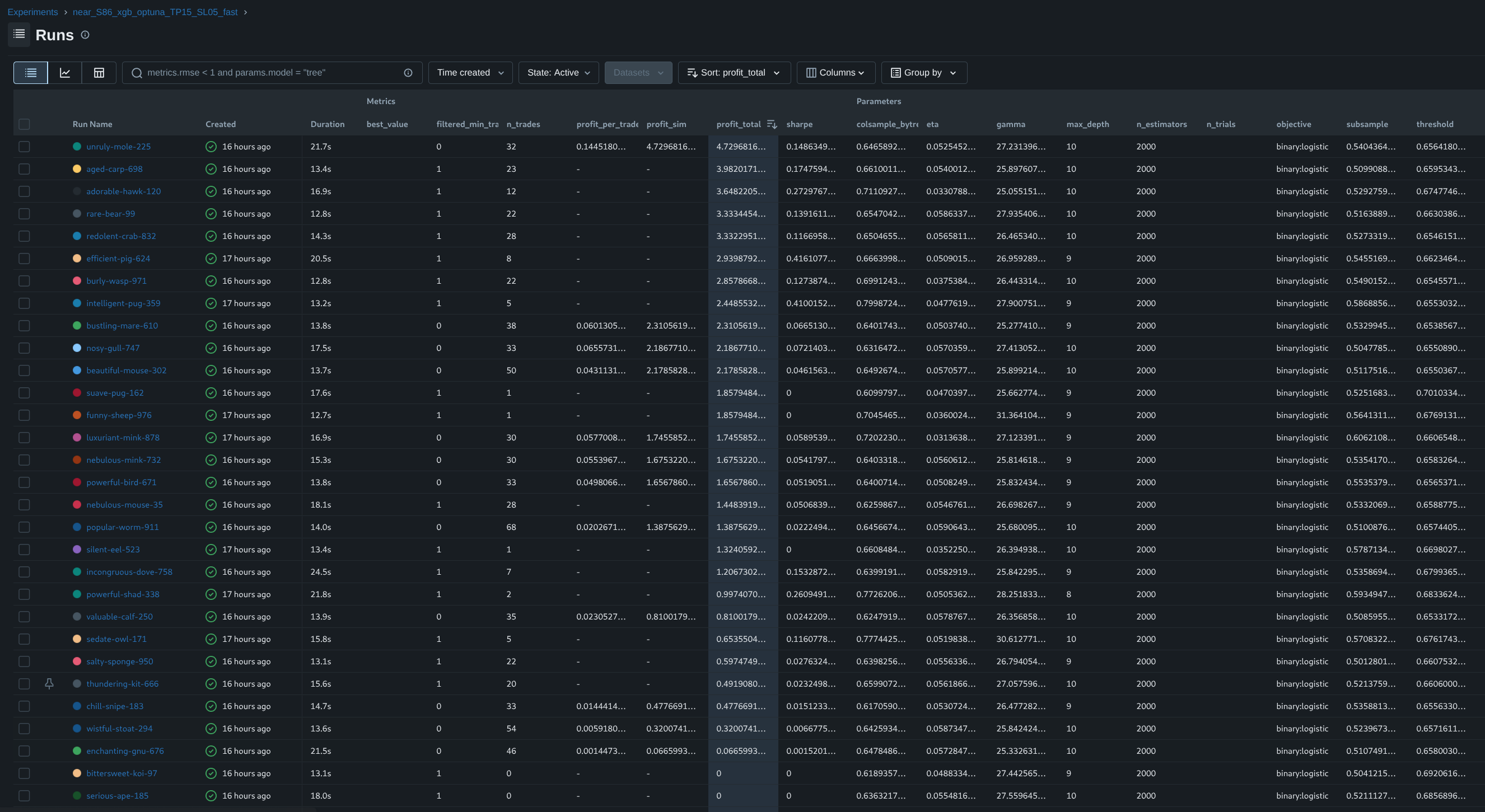
The MLflow runs table for the trading models. Every row is one
training run; every column a logged parameter or metric (precision, recall and
the rest), so runs line up for direct comparison.
View full size ↗
Each run records its parameters (what was tried), its
metrics (how it scored — the precision/recall numbers
behind that curve in Act 4), and its artifacts (the trained
model itself). Because the logging is uniform, model selection becomes a
sort-and-filter over a table rather than a matter of memory or vibes: you can
ask “best precision at a given recall” and get an answer you can
reproduce tomorrow.
The features from Act 3 are the raw material these runs consume; the winner is
the model that gets promoted into the live Strategy box from Act 4. Which means
it stops being a row in a table and starts doing something with real money.
§
Act 06
Live orders on Binance
When the selected model’s confidence clears a coin’s threshold, the
Strategy box does the thing all of this was for: it places an order. Not a
paper order — a real one, on the exchange, with the account’s own
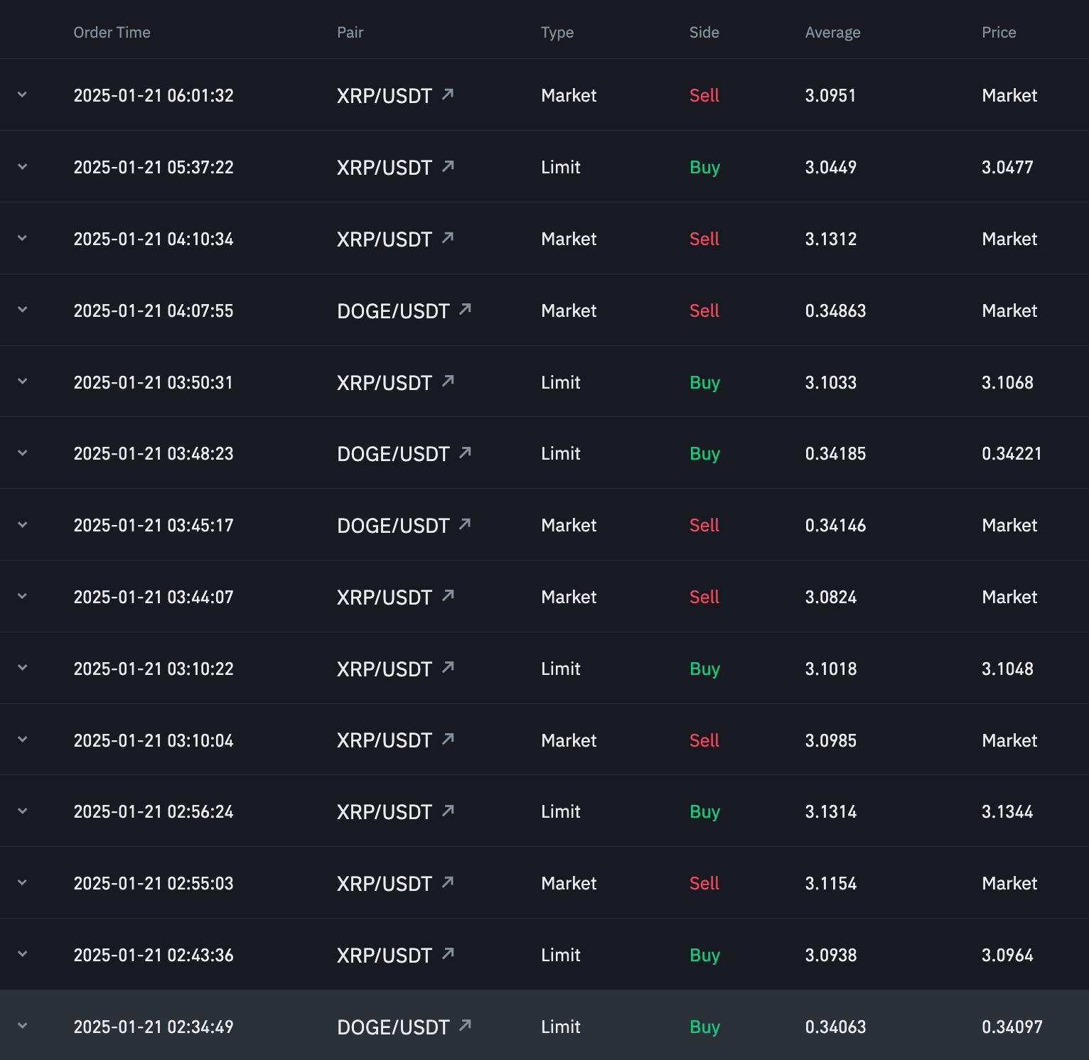
funds. Here is a slice of that order history.
Executed orders on Binance. Each row is a real order the bot
placed — market and limit, buy and sell, across XRP and DOGE — with
its timestamp and fill price. View full size ↗
This screenshot is here to show one thing: the loop closes. Raw feed →
candles → features → a trained, selected model → a strategy → an order
that actually executes on a live exchange. It is not a performance
claim. The system is experimental and has no proven profitability track to
point at; what it has is a complete, working path from market noise to a real
trade.
Which leaves one last question, and the most fun one to answer live: what is
the model thinking right now?
§
Bonus
Get signals on Telegram
Don’t want to leave this page open? The same buy signals the system
produces are pushed to a Telegram bot the moment they cross the entry
threshold — so you can watch from your phone while the bot runs
on the server.
Subscribe to @Bintri_Alerts_bot
to receive a notification each time the model decides to enter a position
on any of the five tracked coins.
The current models are deliberately conservative: a buy signal is only
issued when the model’s confidence exceeds a per-coin threshold
that is rarely reached in normal market conditions. In practice, the
bot may go days without triggering a single entry. Silence is not a
prediction that prices will fall — it means the model does not
see a high-confidence setup.
Not investment advice
All signals generated by this system are shared for informational and
educational purposes only. They do not constitute financial advice, an
offer to buy or sell any asset, or a recommendation to trade.
Cryptocurrency markets are highly volatile; past performance is not
indicative of future results. Never invest more than you can afford to
lose.